By now I’m sure you’ve all seen Tesla’s new Cybertruck. It’s big (no seriously it’s freaking huge!), it’s shaped like a triangle on wheels and is bullet proof. But as exciting as the unveiling event was, there was something virtually everyone either missed or just basically glazed over and ignored: the new software interface.
This brand new user interface was on display for all to see during the many demo drives that were done throughout the night. This completely redesigned user interface looks to be a huge departure from what’s currently being used in Tesla’s today and could possibly be debuted under the next major release V11.
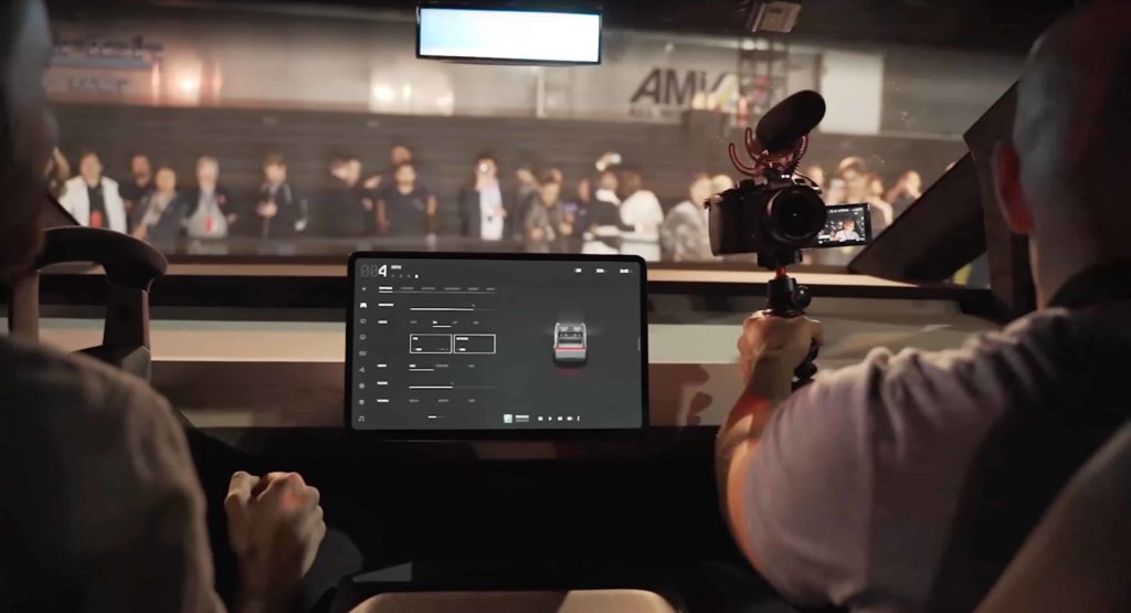
Just like the Model 3, the Cybertruck has a 16:9 horizontal centre display with no other apparent HUD or driving dashboard type screens to be seen. While there were no pictures or demonstrations throughout the actual unveil that really showed off the new UI, we did get a good look at it via all the people that went for test drives.
While the exterior design of the Cybertruck is obviously badass, it was this new UI that really peaked my interest and has even more so since. I’d also like to give a shout out to both DÆrik and Teslanomics YouTube channels as it was through their videos that we’re able to get the best look at this new interface. Let’s dig in!
A Complete Redesign
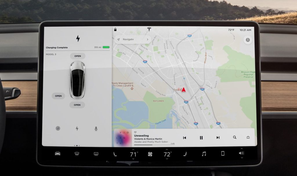
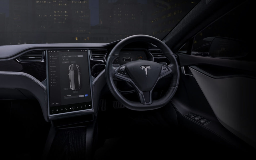
With the Model S and X that have vertical displays it’s not really surprising to see them having a semi different UI design and layout versus the newer Model 3. They’re different orientations and they have two displays while the Model 3 only has the one. Despite these differences they are still quite similar as you can see below.

Tesla Model 3 Interface 
Tesla Model S Interface
Given how starkly minimalist and similar the Cybertruck’s setup is to the Model 3, one would expect Tesla to essentially just copy/paste their awesome interface over. Maybe there might be some slight tweaks to make use of the bigger real-estate on the 17″ screen, but instead Tesla has completely redesigned everything!
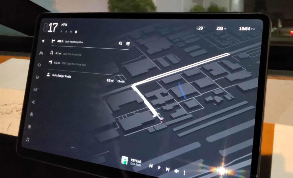
Gone is their dedicated 1/3rd side bar. Gone is the familiar and industry leading Google Maps navigation system. Even the bottom locked AC controls (the black bar on the Model 3 interface) have been shuffled up and to the left! Considering how amazing and well designed their current Model S/3/X UI is I find it frankly shocking that they’d just throw it all out the window.
Now I’m not saying this new one is worse or even better. We haven’t seen nearly enough of it yet not to mention I’d like to use it for a while before passing final judgement. But normally a company with an industry leading interface doesn’t just stumps up and start from the beginning again!
Frankly I’m both shocked and highly impressed. It’s moves like this that, to me at least, show Tesla does not stand still. Any other company would have sat on the Model 3 UI and milked it for another decade until they were actually threatened by another competitor. By charging ahead again, despite their huge, huge lead over any other car makers UI shows honest, proper innovation. Awesome to see these days.
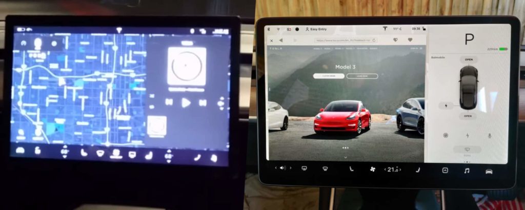
I’d also like to point out here that the Cybertruck is a one of a kind, semi prototype thing at the moment, so we will likely see this interface evolve a bit more over the next two years. That being said, in the past Tesla has shown near final versions of their UI’s when unveiling new cars so I don’t expect that much to change. You can see above the difference between what was on show during the Model 3 unveil event test drives and what it eventually ended up becoming.
Driving Visualisations
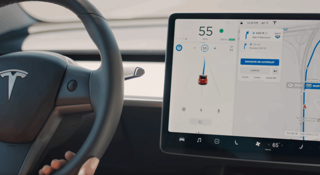
To begin with we have the main, general driving mode. The Driving Mode interface is much changed from what you see in the Model 3. On the Model 3 an entire 1/3rd of the screen is taken up by a dedicated “driving visualisation” area as seen above. The remaining 2/3rds is for the maps or whatever window you have open. With this new UI seen below however the whole screen is used for the driving visualisation area.
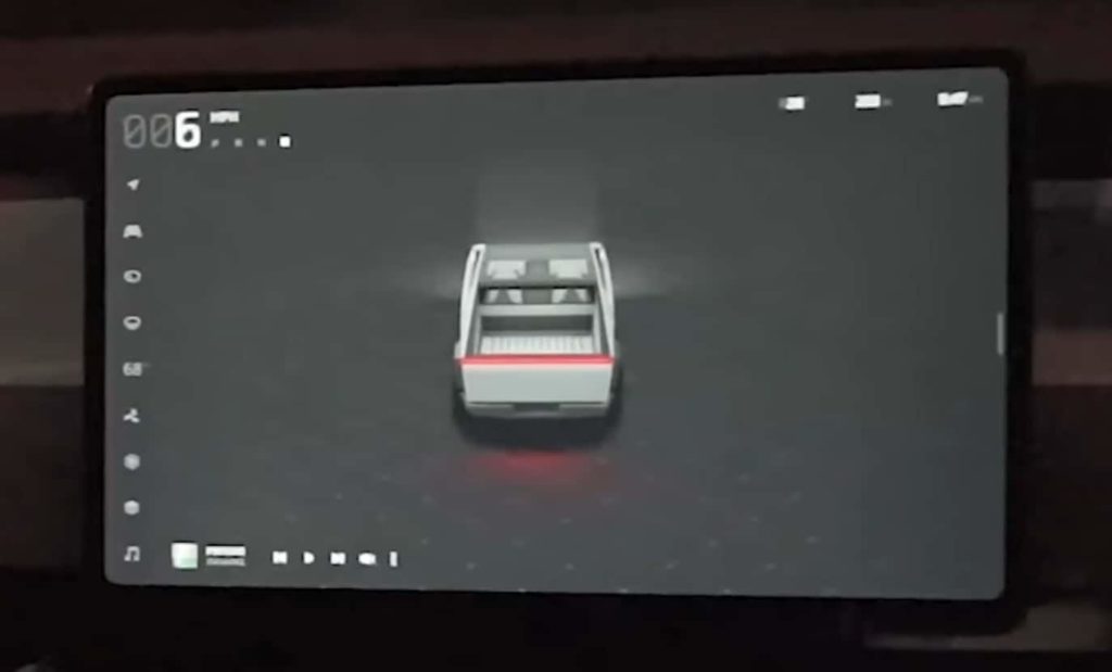
If I had to guess why Tesla are moving in this direction I’d say that it’s because they simply just need more room to display more content. So while the above image obviously doesn’t show much now, it’s likely that one day it will be filled with all sorts of CGI represented real world objects.
Think about just driving down a moderately busy road. There might be dozens of cars in front of you, dozens more behind, multiple parked cars either side, traffic cones, stop lights, lines, road signs, people and more. In order for Tesla to have people use their Autopilot system they have to solicit trust and confidence in it. To do this they’re going to need to show you exactly what it’s seeing in as much detail as possible.
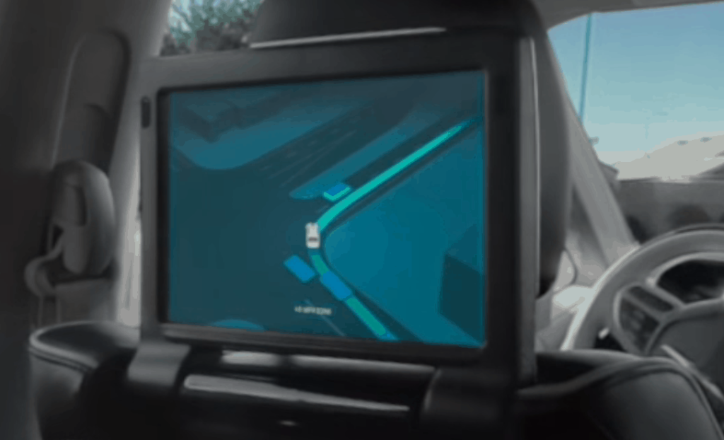
As an example of another company doing this we have Waymo. They have a fully dedicated screen right in front of the users in the back seat. On it you can see a CGI version of the world around you in real time. Every car, lane, building and so on.
Currently on the Model 3’s interface that’s restricted to a mere 1/3rd of the screen and so displaying all this information just isn’t really possible. Cramming 30+ car graphics, lines, signs etc all into a third of a 15″ screen will just make it look horrible and confusing. Expand that area out to the entire screen like on the new UI though and now we’re talking!
It’s yet another step that Tesla is taking to push their cars and customers towards the fully autonomous future. When your car is driving itself, you’re not as concerned with the route it’s taking so you probably don’t want to see maps 100% of the time. Instead you want to know what it’s seeing and knowing that you can trust it in the moment.
General Controls
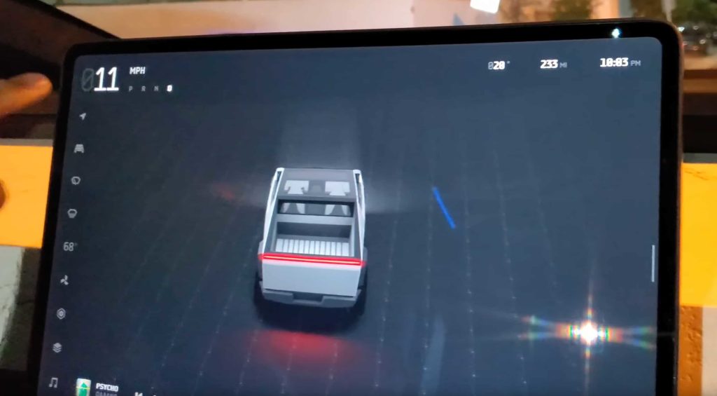
After watching a number of different “driving demos” from various YouTubers it’s clear that while the interface seems to be vastly different, there are a number of similar things that have been carried over. In the above picture of the Cybertruck interface there’s a bunch of changes compared to the Model 3’s UI.
Firstly the bottom main controls (AC, Music buttons etc) have been shifted over to the left. They’ve also been tweaked a little and two new ones have been added down the bottom. There’s a hexagon style icon as well as a “maps layer” style icon. While the maps layer icon could possibly be used to access said map layers I’m guessing it’s actually more likely to be for something else.
This is because you can see the navigation button up the very top and any “maps layer” controls are probably going to be displayed inside that main navigation area. I’m not sure why you would want to change maps layers so often that a full, dedicated controls button would be used for it. Just doesn’t make sense.
Back to the two very odd, unknown buttons on the main controls, what could they be for? What does a hexagon and “map layer” icon usually represent? I don’t know. If you have any ideas (or hopes) maybe shout it out in the comments below but I’m very curious about what they could be, especially the hexagon one.

If I had to speculate I’d imagine one of them is the kind of “over flow menu” we currently have in the V10 software. That’s currently denoted with an arrow icon (as seen above) which makes sense but perhaps instead of now opening an overflow menu it pops up a full screen that lists dozens of apps, entertainment options, games and so on.
Over the years Tesla has added more and more stuff to the OS such as energy graphs, trip graphs, YouTube apps, games, calendars, phone access, not to mention everyone constantly asking for an app store or even a games store. Perhaps the hexagon is a single “apps store” type button where you access something similar to the Google Play Store or the Apple Apps Store.
You could download, install, update and uninstall all sorts of apps from games to tools to entertainment apps just like you do on your phone. Elon has stated in the past that he wants to introduce more and more games and that you’d have to essentially choose which ones you wanted and download them because there’s just not enough local storage space available in the car to hold infinite games.
I’d honestly love to see the car expanded in this way along with a hardware upgrade available by Tesla that installed a 500 GB or more SSD in the car to enable basically anything you wanted. It’d also double as an approved place to store Dashcam and Sentry Mode footage that’d be fully locked away inside the car instead of a USB drive hanging out of a port. Currently the best solution to this security issue is the Jeda Hub which we reviewed here.
This app store could obviously include the in built apps like a Dashcam or Sentry Mode video viewer, Calendar, YouTube etc too. Whether Tesla wants to expend it’s limited resources diving down this deep rabbit hole is a different matter. I could also be way off here as this is just pure speculation! It’s also possible these main control icons can now be user customised, moved around and so on which would be great too.
Missing In Action
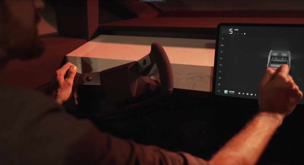
It’s also interesting to notice what’s not on the screen too. Comparing it to the Model 3 interface again there’s a number of buttons completely missing.
- Bluetooth Button (Top)
- WiFi Button (Top)
- Profile Chooser Button (Top)
- Tesla Logo Button (Top)
- Lock/Unlock Button (Top)
- Reversing Camera Button (Visualisation Area)
- Charging Button (Visualisation Area)
- Voice Commands Button (Visualisation Area)
That’s a lot of missing buttons! As minimalist as Tesla is currently it looks like they’ve further stripped everything down once again. In fact the only things that are left are the speed, drive selection, temp, range and time.
Personally I’m all for obliterating irrelevant and unused icons/buttons. Things like the Bluetooth, WiFi, Tesla Logo, Charging and Voice Command buttons I don’t ever touch. They could all be moved under a sub settings menu and it wouldn’t matter I don’t think.
The Profile Chooser button is quite important though as it’s something we’ll press occasionally if both the wife and I are getting in the car at the same time and it doesn’t automatically chose the right profile. Reversing camera quick access via the buttons is quite handy too as sometimes you want to see what’s behind you even when you’re driving forward. I also know many owners like driving with the camera view up all the time.
I can imagine the Charging button might be removed as you can already press the range text in the top right to access the same things. Overall I quite like the minimising of excess buttons and such. With all the buttons up top, down the bottom, the driving visualisations and so on things have started to get a bit cramped and crowded.
It’ll be interesting to see how they marry the stark and simpler interface design with having new owners come in and not knowing what to do. Sometimes if you have too many “hidden menus/buttons” the user can easily get lost or just never know certain features exist at all.
Buttons & Dials
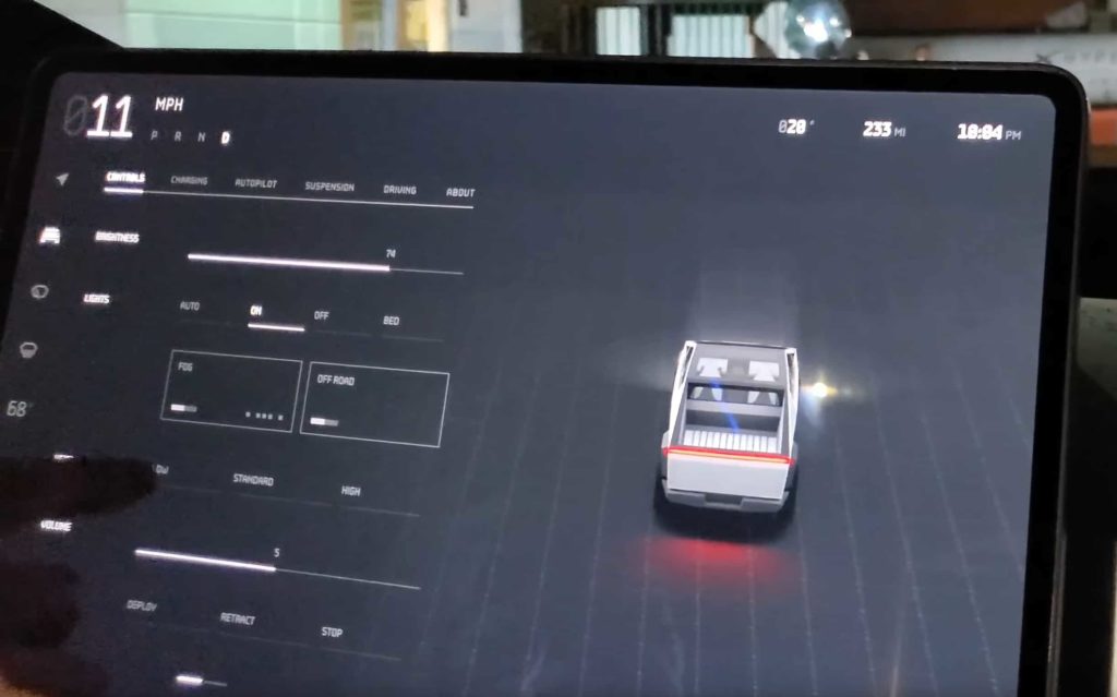
The bottom main controls aren’t the only things that have been changed, we also have a completely new font and totally different menu screens. As you can see above the Controls menu is a tabbed interface that melts into the general Driving view. This Controls menu used to be a full window that opened up over the Maps area.
The new tabs seem normal enough but have been reorganised from what’s currently running on the V10 software. Currently we have dedicated sections for quick controls, lights, safety & security, locks and display which all are missing on this new interface.
Again I’m glad to see Tesla pairing things down and arranging things together in a way that still makes sense but has fewer screens. My guess would be that Quick Controls, Lights and Locks have all been moved to the first tab “Controls”.
The new selector options, volume controls and so on are all also newly reworked too. While the current V10 software has blue accents on an either white or black background depending on Day or Night mode, this new potentially V11 interface goes for a much more futuristic look and feel. Also the entire colour scheme appears to only be black and white with various other tones here and there.
The only part that has colours in it at all seems to be the actual car graphic, which is hugely enlarged and far more detailed than it is in V10. This car graphic also has very nice animations to it as the screen modes move from one to the other.
Navigation Mode

Finally we have the biggest change overall which is the Maps or Navigation Mode. Currently V10 software has industry leading graphics and displaying of maps. You essentially have a giant full screen view of Google Maps in your car and it’s fantastic. Everyone that hops into our Model 3 loves it as it’s so good, so easy to see and like nothing else out there.
While there are many requests for Tesla to add multiple waypoints, different selectable navigation paths (like in Google Maps), temperature overlays and more to their current mapping system, it looks like they’re wanting to do much more.
While the Navigation Mode might not always be as detailed as what’s shown above due to map data availability, it’s none the less impressive to see in action. We get a dimensional upgrade going from the current 2D based maps in V10 to wire frame 3D building outlines.
It’s also super cool to watch the transition animation from the general Driving Mode to Navigation Mode. This takes the full sized, super detailed graphic of the Cybertruck and progressively shrinks it down into the map as it loads up the route shown above.
This also results in the navigation car graphic being a super high detailed version of your exact car. Currently in V10 software the car is represented just as a generic red arrow (seen below) similar to many other car makers maps systems.
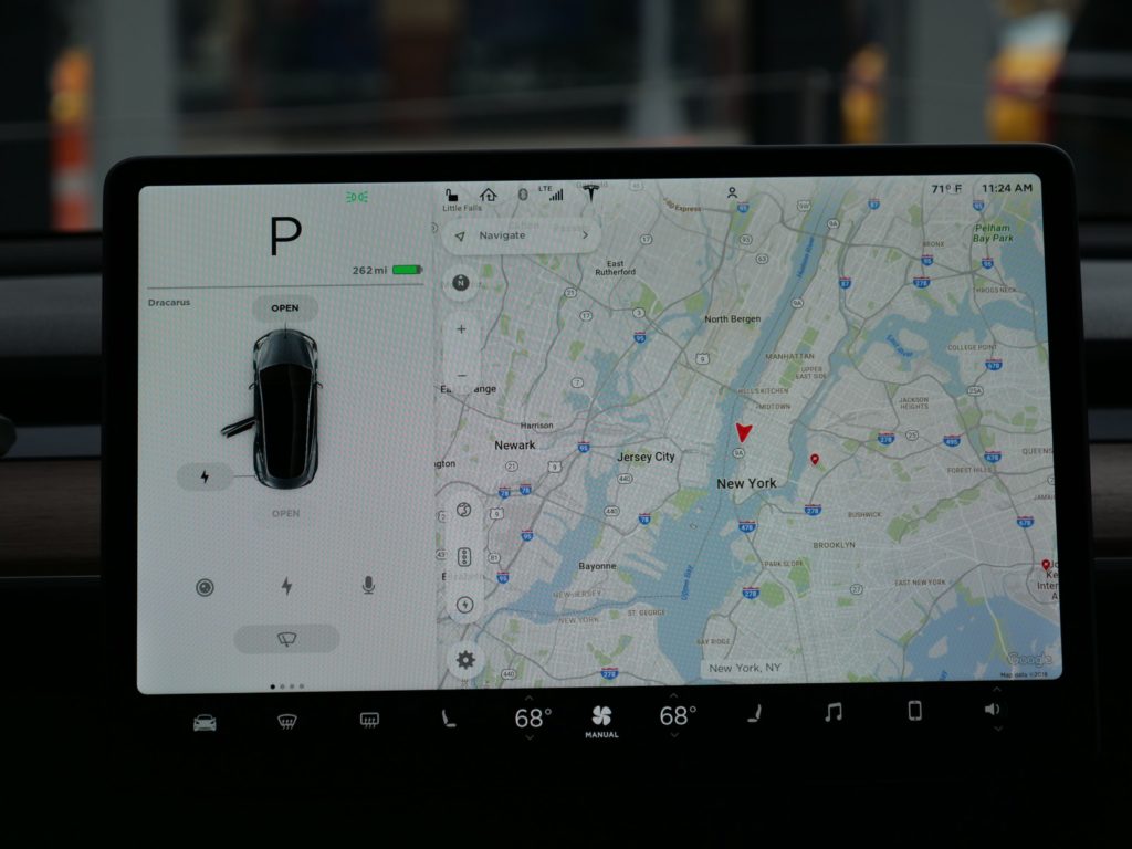
All of these transition animations, detailed 3D map data and high level car graphics combine to give a highly impressive overall look and feel. As far as I know, no other car mapping system comes close to this level of fidelity. This is likely because Tesla now has full access to such a high power compute architecture.
While other car makers put in the bare minimum computer that can barely render 2D on a puny 7″ screen, Tesla is pumping out pixels left and right at high frame rates like an advanced gaming computer would.
We also get to see another interesting feature shown off in this view which is the new Music widget. Down the bottom of the other screenshots we can see the music widget in the left hand corner, but as the Navigation Mode loads up it pushes this widget over to the right to make room for the directions on the left.
Currently Music is treated mostly like any other generic window content but this seems to be changing. While this doesn’t look like it is too significant of a change it’s again nice to see Tesla constantly experimenting and pushing for better, more dynamic interface designs. This is what keeps UI’s fresh and modern rather than slowly dating and getting old.
A Glimpse Into V11
While the demo drives for Cybertruck were very short and the presentation of the this new, potentially V11 software interface non-existent we none the less get a very detailed glimpse into what Tesla’s planning.
From hugely increased vehicle graphic details to 3D wire frame mapping to mysterious new main control icons there’s a heap to digest. There’s even more unanswered questions like have they made any other mapping improvements like waypoints or weather overlays? Do they now show 3rd party chargers on the maps along with Superchargers? What does that hexagon button do? How do you switch driver profiles and more.
While I’m sure we’ll slowly learn the answers to all of these questions over time one thing is clear, this looks to be Tesla biggest release since V10. Whether it’s released as V11 – what I’m referring to it as now for simplicity sake – or something else is unknown right now.
The overall look and feel of it seems highly polished and ready to go indicating that it could be released relatively soon, say within the next 12 months. However UI polish could be masking thousands of unresolved bugs or other back end issues meaning the release would be further out. It could even be dependant on having enough detailed mapping data or some other unrelated bits and pieces so we really don’t know just yet when this update will drop.
I’m hopeful it’s sooner rather than later though as it looks like a fantastic update overall. So what’s your favourite part of this new interface? Let us know in the comments below and feel free to point out any other things that I may have missed.
The benefits include: 1) How to get those silky smooth videos that everyone loves to watch, even if you're new 2) How to fly your drone, from taking off to the most advanced flight modes 3) Clear outlines of how to fly with step-by-step instructional demonstrations and more 4) Why flying indoors often results in new pilots crashing their drone 5) What other great 3rd party apps are out there to get the most out of your drone 6) A huge mistake many pilots make when storing their drone in the car and how to avoid it 7) How to do all of these things whilst flying safely and within your countries laws.


